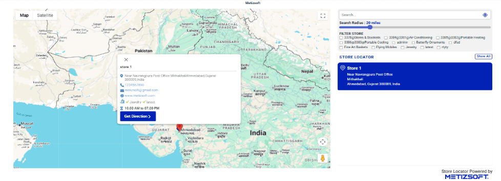
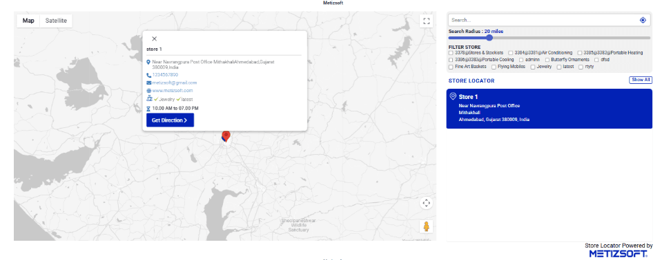
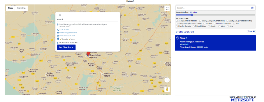
Store Locator Layout
Personalize your store locator with the right map visual style and page layout. Create a branded, user-friendly experience that converts.
Create Your Store Locator NowPersonalize Your Store Locator
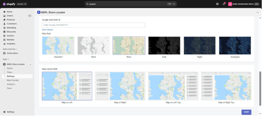
Our store locator is more than a simple map—it's an extension of your website's branding and customer journey. To make it both functional and visually aligned with your business, you can customize two main aspects:
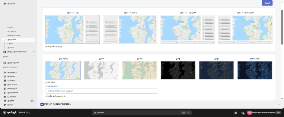
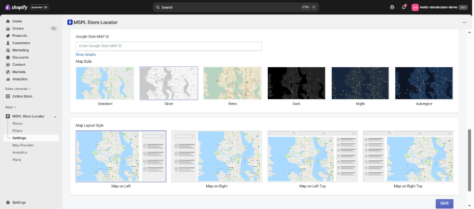
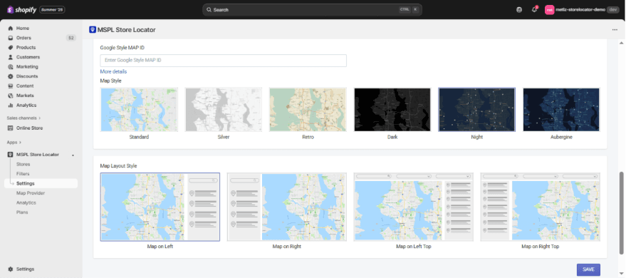
1. Map Styles
The map style determines how your store locator visually appears to customers. Instead of sticking to a single standard look, you can choose from multiple pre-designed styles depending on your brand identity.
Standard (Default)
The classic Google Maps look that most users are familiar with. Clear roads, green landscapes, and simple pin visibility. Best for businesses that value simplicity and familiarity—ideal for retail chains, grocery stores, or service centers.
Standard Map Style
Standard Map Look
Silver
A minimalist, muted, and modern look. Uses light grays and subtle tones instead of bold colors. Perfect for premium, luxury, or corporate brands that want the map to feel clean, calm, and professional.
Silver Map Style
Silver Map Look
Retro
A warm, vintage-inspired design with beige and earthy tones. Evokes nostalgia and friendliness while still being clear. Great for artisanal, boutique, or heritage-focused businesses such as bakeries, breweries, or handcrafted goods.
Retro Map Style
Retro Map Look
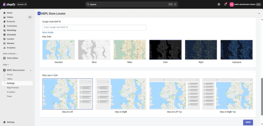
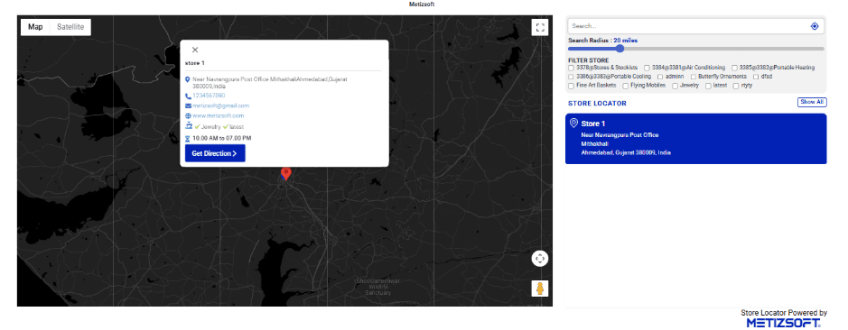
Dark
A bold, black-themed map style with strong contrast. Feels sleek, stylish, and modern, making store pins pop visually. Ideal for high-end brands like tech companies, fashion outlets, or premium restaurants that want a more dramatic look.
Dark Map Style
Dark Map Look
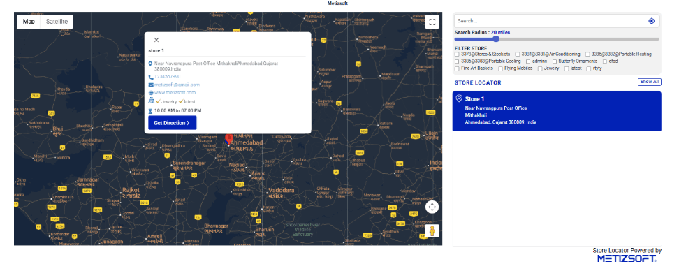
Night
Designed with dark blue and muted tones, resembling nighttime navigation. Easy on the eyes, especially for users browsing in low light. Works well for nightlife brands, bars, entertainment venues, or late-night service providers.
Night Map Style
Night Map Look
Aubergine
A creative purple-toned map style with unique contrast levels. Adds personality and fun to the map without being overwhelming. Best suited for lifestyle, beauty, or youth-oriented brands that want to stand out with vibrancy and uniqueness.
Aubergine Map Style

Aubergine Map Look
Why Map Styles Matter
Each style changes how users emotionally connect with your locator. A grocery chain might use Standard or Silver for clarity, while a nightlife brand might choose Dark or Night for mood. By aligning the map's style with your brand, you create a seamless digital experience.
2. Map Layout Styles
The layout style decides how your map and store list are arranged on the page. This matters for usability, readability, and user flow.
Map on Left (Default)
The map sits on the left side, and the store list appears on the right. A balanced, classic design that works across industries. Best for businesses that want a straightforward, easy-to-use layout.
Map on Right
Reverses the default: map on the right, store list on the left. Sometimes aligns better with websites where the design flow leads from left to right. Useful when you want the list to be the first thing users see before exploring the map.
Map on Left Top
The map is placed above the store list (stacked design). Works well for mobile-friendly sites or landing pages where vertical scrolling feels natural. Great for audiences who expect quick browsing on smartphones.
Map on Right Top
Same stacked layout but with the map on the right side. Adds variation to standard layouts while still being mobile-optimized. Works best when your site's design favors right-hand visuals.
Why Layout Styles Matter
• A side-by-side layout (Map Left or Right) gives users a broader view of both the map and the list at once.
• A stacked layout (Map Left Top or Right Top) is better for mobile-first audiences, as it flows naturally with scrolling.